The link can only be currently found under the green download button on the en-US home page and is the main way that people from communities without localized landing pages access their language tools (another project Seth Bindernagel and I are working on). Regardless of how people get there, the all.html page is important to maintain and improve because it is one of the principle ways people access Firefox in different languages.
Having said this, the current all.html page not performing well: 44% of users are bouncing (ie, immediately leaving the page). With more than 250,000 users hitting that page everyday, the page is an important web property and we need to try and maximize the number of these people that actually download by making the download process as easy to understand and as intuitive as possible. Right now, only 25% of those 250K hits (54K) manage to hit download.html which signals to me that either people are not finding what they are looking for or we're doing a bad job of explaining the purpose of the page. I personally believe that it is a combination of the two.
I think that the majority of people hitting this page speak a minimal amount of English and thus do not understand what to do because the page is
1) Wordy and written in English
2) most of the page is displayed below the fold
3) Although the information is displayed in list form, it is overwhelming to a non-English user.
After going through a lot of internal discussions, particularly with Faaborg and other UE experts, I decided that it was worth talking to The Royal Order, a website design firm that designed Mozilla.com, to see if they could make a create an all.html page that would be more intuitive, visually interesting and more obvious in its call to action.
Below you will find the jpegs of the first round of mock ups that the TRO delivered today. Although it is early in the re-design process, I think its important to get the community's input as early in the process as possible in order to ensure that we create the best site we can.
Let me reiterate that these mock-ups definitely need some work before we consider going live. This is why we need your help...we want to hear your thoughts about the design direction for each so we can decide which one to pursue. Essentially, I need to know which of the two concepts, overall, do you like/prefer?
Option 1, Page 1
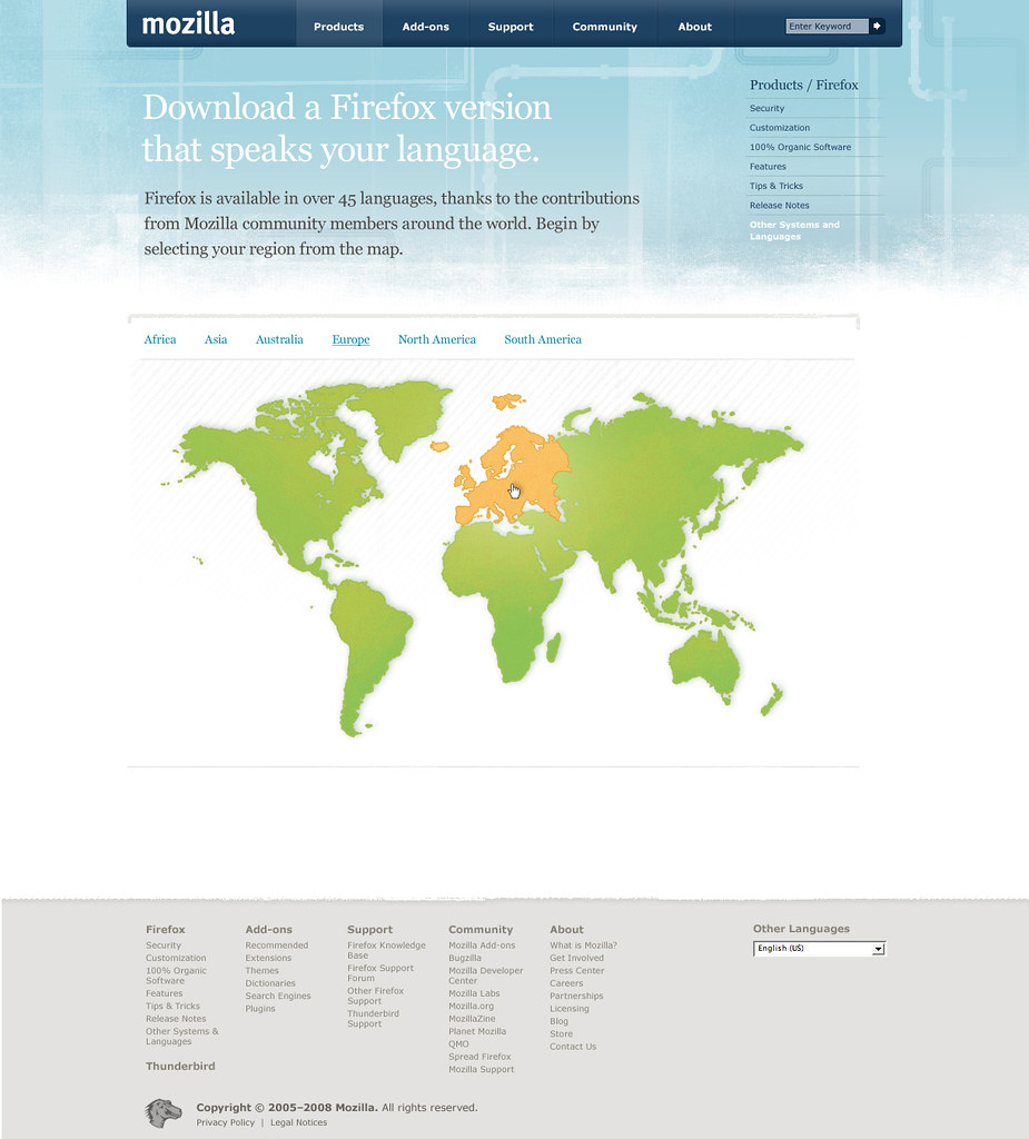
Benefits:
-Map is Intuitive
-When you mouse over the continents/regions they are highlighted orange.
-Visually interesting
-Not too many words
Other thoughts:
Overall, we feel like this page needs a stronger
instruction on how to find the right download for you--maybe with a demonstrative graphic at the top of the page?
Option 1, Page 2
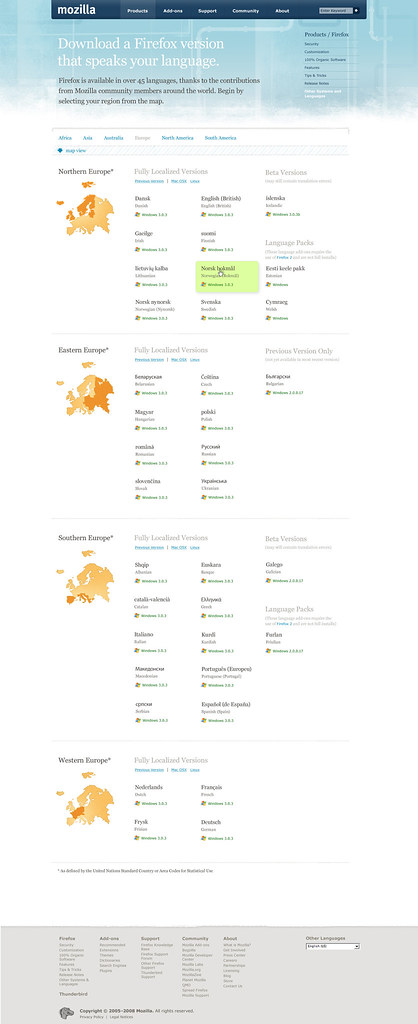
Benefits:
-Organization by region is intuitive
-Native form of language displayed first.
-Easily toggle between systems, versions
-Differentiates between packs, beta versions, localized versions.
-The entire box is highlighted green and to download you click on the box you want.
-Information on page is not too overwhelming.
-Can easily add languages to each region without mkaing the page seem longer.
Other thoughts:
We're thinking that the break down of continents into mini-regions is a concept we want to rethink before going live. There seem to be too many ways to mis-categorize countries and groups of people and we don't want to offend or upset anyone. Be assured that we're working on this issue.
Option 2, Page 1
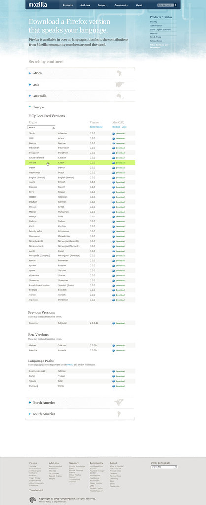
Benefits:
-Page split up by continent
-Intuitive
-Click on a continent, you can use drop down to select a region.
-Native form of language listed first.
-Toggle between systems easily.
-Whole line highlights green when you scroll, and you click the entire line to download.
Other thoughts:
The list format, though easier to read, still seems overwhelming.
Option 2, Page 2

Benefits:
-Continents section highlighted when you scroll over it.
-Easily add other languages to the list.
-Separation between language pack, localized version, beta versions.
We're eager to improve this page, so please send us your feedback as soon as possible.
Thanks for the thoughts!
P.S.
I want to note even though we will decide to go with a version of these two options, this does not mean that the old page will be thrown away. If it turns out that the old page does a better job of securing downloads, we will revert back and try something else.
77 comments:
Definitely option 1, with the maps. Pictures/diagrams/maps are a universal language. And there's not so much information overload.
The continent approach just doesn't work for French, I think you can find a French-speaking country on almost everyone of them.
You will also have to duplicate languages from countries spanning multiple continents, such as Russia or Turkey.
Oh, and in Europe we are teached that Australia is not a continent as it is part of Oceania.
That's just if you thought continents were easy :)
I think that it would also useful to have and autodetection code for the user prefered language and offer him a link: "It seems your prefered language is French".
I also think that continents/countries are sometimes confusing when you mix them with locales. Also that's one of the reasons it's not recommended to use flags to represent languages.
I share the concern about trying to map languages to countries. I'm sure you can find someone speaking just about every language in the world living in Toronto.
Of course, people will likely know what country their language is associated with, but it's still an awkward means of selecting language (though very pretty).
I think that the map is a better option. Like @benoit said, continets aren't the same all over the world.
But maybe Languages are more useful than countries/continents. In South America we have localizations for Argentina's Spanish and Brazil's Portuguese, and maybe someone of Peru prefer another spanish than Argentina. And if he/she choose the South America map, mozilla will suggest Argentina's Spanish or Brazilian Portuguese.
I have made a mockup you can see here: http://mozillalinks.org/images/downall.png
- glyphs are usually an easy way to identify things, so languages are first grouped based on their alphabet: roman, cyrilic, asian
- then, languages are grouped by language families: germanic, roman, western europe, arabic, indian, far east. As a Spanish speaker, when I see Italian, Portuguese, or French I know I am close to what I'm looking for. I'm guessing the same applies to other languages that share a common origin.
- finally, there is a loose geographic arrangement: western (america + western europe) -> mid europe -> scandinavian ->western europe -> asian
- alphabetical order could apply for Roman alphabet languages but not sure about it.
Once the user clicks on his language, the language name and the word download in the selected language is presented along with individual buttons for each OS.
Other than trivially letting English speakers what language each one is, I see no use for all the English language names. They could still be English captions to keep the information without wasting space.
Also, just as the software has to be final quality to be in that page, so should be localizations. So, they should either be ready and listed, or not ready and not listed.
My apologies in advanced for any unintentional mistake with the sorting and groupings. I am no expert on language history but there are natural language commonalities, hence groupings, that may make sense for users.
I also think the map is a mistake - for the reasons already stated and because it increases the number of clicks to get the download started.
Web design companies are very tempted to radically change a (perfectly good) design to justify getting paid.
I think reason #2 (most of the page is displayed below the fold) and then the related #1 (Wordy and written in English) are probably the biggest reason people get confused. I think #3 () is probably not even a reason, give some minor tweaking of the existing page.
Suggestions:
0. Do as much as possible to move the download list up as high as possible.
1. Change "Download a Firefox version that speaks your language." to "Download Firefox in your language"
2. Delete: "Firefox is available in over 45 languages, thanks to the contributions from Mozilla community members around the world." We've already bombarded them with propaganda on the home page.
3. Remove the "Features / Security /..." menu on the right, or title it with something clear, like "About Firefox".
4. Remove the logo and jump anchors, or move them to the top-right.
5. Put the language's primary flag in the left column. Yeah, I know... Who cares!? It'll still be much clearer for almost all cases that way.
Please, no click-me maps and always let the user select any language and any OS!
I've heard a lot of people from european p.m.o. (or maybe just glazou a lot of times) stating very clearly that "flags are not a good description of language"... I'm not sure if maps are much better, since, especially if somebody can't read the title text because they don't speak english, might just click on the country they live in instead of the country of the language that they speak. And then they would get something in some weird language, and then they just give up.
And, i don't really know what the percentages of people in the world know where the language that they speak originates. Especially if there are minor dialects. I mean, what if to get "generic english" you had to click on great britain? I'm sure that many many of the smaller languages have problems similar to that.
So, i think i'm in favor of percy's mockup, certainly in combination with option 2, and i can imagine europeans and everyone not in america preferring something not map-based.
I do, however, really like the fact that you're doing something about this page.
I found that people here in Israel prefers to use the English version or the localized one. I order to make it the most easy task for them, we've launched our own download page (in fact, there are only few links to that page) at http://firefox.co.il/download/, which allows the user to download the browser in his prefered language and os, and still it doesn't take too much space.
We can expand it and give the little green download box more power so users won't need the all.html page at all.
I was going to comment saying that maps aren't a good indication of language, but everyone else already did that... and I agree for all for all of the reasons listed.
+1 to Percy's mockup with some changes:
I would just order locales alphabetically with their name in their language and just separating the occidental, Cyrillic and Asian as 3 groups to be able to sort them.
I would consider using faceted navigation (an interaction design pattern) on this page.
It's a very flexible and powerful navigation paradigm that (among other things) gives the user complete freedom in selecting continent/version/os/alfhabet in the order he/she prefers.
Or simply just select a language from the list (if they deem it scannable enough).
I made a very simple mockup of this page using faceted navigation:
All versions
All versions > Europe
What about languages like Esperanto, which doesn't belong anywhere on the map actually?
Also, why not just display any matches between the user's Accepted-Languages header and our list as preferred options at the top?
I have three concerns about the map, the first is accessility. No idea how to make a good accessible page here.
The next concern is echoing what KaiRo said about Esperanto, though that's an edgecase which can just be fixed somehow.
The biggest point is actually my third one. Lack of education. Have you seen those reports on TV where people on the street are asked to point at the continent they're on? Depressing, but true.
I don't think that the map proposed comes with any of the common problems of flags or countries, as it was way more corse than that. I'd try to keep France and Spain in the same region, as there are a variety of languages fighting over that border, but that's an implementation detail.
The most common complaint was that the languages should appear more than once, and that's totally possible. Like, adding Turkish and Arabic to the languages offered in Europe makes total sense to me.
I personally am a friend of faceted browsing, but that needs some form of entry hook.
Maybe some form of autocomplete search bar?
I found percy's mockup to be totally confusing, btw.
To get the UI bootstrapped with user data, we'll run into a performance problem. But maybe we can just create a small js data piece from geo-location and accept-lang. The latter is likely going to be less important, as many people don't configure accept-lang to actually work for them. I guess.
What would be wrong with a page that went like this (in a sensible and perhaps dynamic order based on accept-language, popularity, alphabetical or whatever):
I speak English (en)
Je parle Francais (fr)
我说普通话 (zh-TW)
Я говорю по-русски (ru)
...
After they've picked that, you can worry about OS etc. on the subsequent page, which will actually be written in the language they speak.
I wonder if we could seed the offered data by time-of-day.
Would we have stats on how locale downloads spread over the day?
Give up on trying to show all the information in a list.
If I'm looking for the Icelandic translation I don't need to know what version the Dutch translation is at.
Just show the language names, in the native form. Nothing else.
1. Highlight each language when hovered—a big green box, perhaps.
2. Intensify the highlight when it's clicked—make the box a stronger green. Fade the other languages.
3. Expand the selected language's box to show the version number, the guessed OS, and a large “Free Download” link. Have a small link to choose a different OS.
4. Clicking outside the selected language's box deselects that language.
Maps won't work, for much the same reason flags don't: they represent countries. Several countries can use one language; one country can use several languages.
Language is the best way to represent language.
It doesn't matter if I can't read all the options: I'll be able to read the useful ones.
(One small problem: maybe I want the Chinese version but don't have support for Chinese characters in my current browser. Simple solution: show language codes as a fallback, discreetly, immediately below each language's name.)
ป๋าจัดให้
BNC333
PAproject
โรงเรียนวัดเมธังกราวาส
Astore Submission
โปรโมทเว็บ
Laos Guestbook
Directory Submission
Car Insurances
Bandit Lao
Job For Lao
Home Generator
โหลดเกม
วัยรุ่นเชียงราย
สามัคคีวิทยาคม
เสื้อผ้ามือสอง
หลุดดาราไทย
I enjoyed your post. I have been wondering about this topic,so thanks for posting. I’ll likely be coming back to your blog. Keep up great writing.
Video AC Milan|Video Sepak Bola|How To Make a Kite|How to make a origami|Tips for lossing weight|How to six pack abs
sohbet odaları
sohbet
yonja
chat siteleri
forum siteleri
toplist ekle
sohbet
yonja
netlog
sohbet
kizlarla sohbet
sohbet
sohbet
dini sohbet
islami sohbet
sohbet
sohbet chat
mirc indir
cinsel sohbet
porno izle
camfrog indir
lida
kurumsalseo.com R10 lida fx15 pohudey zayıflama
sohbet
chat
Thanx You Admin or Usher's Very Good post is :
Sohbet - UK Based Canoe and Kayak Distributor, specialising in all types of paddle sports, Sea Kayaking, Open Canoeing, Canoes, Kayaks, SitonTops, Touring, Surfing, White Water River Running, River Play, Playboating.
Chat - Designer Warmth Radiators offer a huge selection of Modern and Chrome Radiators including Vertical, Horizontal, Column and Electric Radiators, Towel Warmers, and Heated Towel Rails at discount prices.
Sohbet Odaları - Buy cheap prescription glasses and prescription sunglasses online from £15. Choose from standard, semi-rimless, acetates, bendable, rimless, designer sunglasses and spectacle frames.
Kızlarla Sohbet - Electric gates and security barriers installed by our experts from Midland Gate Automation. Professional, personal and friendly service to both residential and commercial customers.
Sohbet Odaları - Professional chefs clothing, restaurant uniforms and protective workwear for the catering industry. Chefs jackets, chefs trousers, chefs hats and neckerchiefs, waiter and waitress uniforms, bar staff uniforms, catering aprons and tabards, money pockets, boilersuits, hygiene coats and even childrens chef uniforms.
Sohbet Siteleri - High quality perfumes on the best prices.
Mirc indir - Private investigators offering private detective services in the London area, across the UK and worldwide. Crown Intelligence are professional investigators supplying private investigation services like partner surveillance and bug sweeping.
Porno izle - For the van hire and rental at the absolute lowest prices come to yellohire UK. We offer huge discounts and savings if you book online or over the phone.
Dizi izle - Best tanning beds for your salon or for your home. Low prices and great components and features from vertical or horizontal beds.
Dini Chat - Good post,I think so!abercrombie and fitch on Sale, Hoodies, Jeans, T-Shirts, Pants, Polos hollister abercrombie outlethollister clothing Abercrombie Men Tee abercrombie womens polos Ruehl No.925, Men, women, and children's clothing. abercrombie and fitch , ,abercrombie and fitch and abercrombie and fitchfashion is bold and interesting, all thanks to the interestingand original designs of Don
Beatiful Text or Dokument Localition...
Thanks you..
sohbet
sohbet odaları
chat odaları
bedava chat
Interesting post. I have been wondering about this issue,so thanks for posting. I’ll likely be coming back to your blog. Keep up great writing. Find your great Travel News and sing the songs at Free Song Lyric or you can watch the drama at Korea Drama Online one of great korea drama is A Love to Kill, boys before flowers and biscuit teacher and sugar candy if you go to travel to Indonesia learn Learn Indonesia Language first! And find your home cari rumah or make a blog Belajar membuat Blog find your home again rumah dijual and again at jual rumah The point is cari rumah, jual rumah, rumah dijual, download youtube and find blog widget and then if you want buy a new laptop see the Laptop Price List just calm down piccam or you can buy a New Blackberry and then take care your Health & Jewerly good job, very great article Cari Rumah, Jual Rumah, Rumah dijual Thanks ever so much Cari Rumah, Jual Rumah, Rumah dijual very useful article Cari Rumah, Jual Rumah, Rumah dijual Great information Cari Rumah, Jual Rumah, Rumah dijual I like your blog Cari Rumah, Jual Rumah, Rumah dijual I will be checking back for any new articles Cari Rumah, Jual Rumah, Rumah dijual, rumah selebritis, rumah politik, rumah group band, rumah seleb just bookmarked it for later reference Cari Rumah, Jual Rumah, Rumah dijual, free scholarships, Wikilaw, eporchshop, free wallpapers, free gadgets. Thanks for kindly sharing it with us. Very well done indeed
sikis izle
porno izle
sohbet
sohbet odalari
sohbet odasi
mirc indir
sohbet
Chat
Kızlarla Sohbet
Sohbet Odalari
Sohbet
mirc indir
Sohbet Siteleri
cam balkon
müzik dinle
limewire indir
limewire
Mirc indir
Porno izle
Dizi izle
Dini Chat
Web Hosting
Web Tasarim
porno izle
Sex izle
Sex
Thanks so much for this! This is exactly what I was looking for
sohbet sohbet odaları sohbet odaları chat odaları sohbet odası bedava chat sohbet siteleri bedava chat chat turkchat aşk sözleri
Definitely option 1, with the maps. Pictures/diagrams/maps are a universal language. And there's not so much information overload.
Regards,
SAP Business
Let me reiterate that these mock-ups definitely need some work before we consider going live. This is why we need your help...lockerz we want to hear your thoughts about the design direction for each so we can decide which one to pursue. Essentially, I need to know which of the two concepts, overall, do you like/prefer?
Bayrak firmaları
Bayrak
bayrakçılar
dijital kumaş
Dijital kumaşçı,dijital kumaş,dijital kumaşı
masa bayrağı
Dijital Kumaş
kurân-i kerim dinle
Bayrak Fiyatlarıbayrakçı,bayrak fiyatları,bayrak flama imalatı
teknoloji haberleri
Emo-Teknoloji Haberleri
Bayrak
Dizi-film izle
Bayrakçı
Lockerz Davetiyesi
This is a very good site..
sohbet
sohbet odaları
bedava chat
bedava sohbet
çet
sohbet odası
chat odaları
sohbet siteleri
ilahi
islami sohbet
tatli tarifleri
gocek mavi tur
güncel blog
online porno izle porno izle hallederik.org
In an eerie display of asics ultimate 81 collective intuition, the individual choices onitsuka tiger ultimate 81of millions of voters contrived to asics onitsuka tiger ultimate 81 align perfectly the asics tiger ultimate 81 parliamentary arithmetic with the angry ultimate 81 onitsuka tiger ambivalence of the national mood. Mr. Cameron had ultimate 81 asics done enough to secure the keys of 10 onitsuka tiger california 78 Downing Street, the voters judged, but not asics onitsuka tiger california 78 enough to be granted a free hand.
As theonitsuka tiger california prospect of days if not weeks, asics california 78 of uncertainty, of the lack of a government, dawned on investors asics tiger california 78 they responded in the only way they knew and dumped anything with a UK hallmark
Güncel Blog
Forum
Gol Videoları
Ooohh, I bookmarked this page. I really like your site. I’ll bookmark the other pages when I have time
best regard
Berita Terkini
FB
zodiak hari Ini
point Blank
dizi
Nice to be here
Blogger Gurem
Very nice.
Thanks for this great Information.
I like it most.Keep it up give more latest post.
dvdrip movies
The continent approach just doesn't work for French, I think you can find a French-speaking country on almost everyone of them.
You will also have to duplicate languages from countries spanning multiple continents, such as Russia or Turkey.
Oh, and in Europe we are teached that Australia is not a continent as it is part of Oceania.
That's just if you thought continents were easy :)
Regard,
cerita dewasa, cara membuat tempe, cerita Panas, cara memperbesar, ejakulasi dini
Nice article. Thanks
great post!!
thanks for this pist...i will back again to givethe other coment
tube8
redtube
izmir escort
escort
These all ways are good and they depend what is your required.
Mesothelioma
www.Cymplustr.com Ağustos 2010 tarihinde %100 Bitkisel içerikli, etkisi kanıtlanmış, Tarım ve Köyişleri Bakanlığı onaylı CYMPlus ürününün online satışına başlamıştır.
İnsanlığın yüzyıllardır varolan ve sürekli bir arayış içerisindeki büyük sorunu ; kısırlık, iktidarsızlık, zayıf ereksiyonlar, sperm sayısı azlığı gibi rahatsızlıkların tedavisinin kesin çözümü olarak sunulan CYMPlus klinik testlerce de onaylanmıştır.Doğal çözüm olan bu ürün herhangi bir yan etki içermemekle beraber, çok kısa sürede etkisini göstermesi ürün kullanıcılarına büyük avantaj sağlıyor.Kısırlığın CYMPlus'la tarih olmasının yanısıra, çocuk sahibi olmak isteyen çiftlerin yüzünü güldürüyor.Site üzerinden Türkiye'nin her yerine sipariş edebileceğiniz bu ürünü nakit, kredi kartı ve kapıda ödeme seçenekleri mevcuttur.Ürün hakkında detaylı bilgi almak için ister siz arayın, isterseniz "Numaranızı Bırakın Biz Arayalım" servisimizden yararlanın.Messenger üzerinden bilgi, işlem servisimiz sürekli hizmetinizdedir. / Cymplustr.com Online CYM Plus Satış Sistemi
Really your blog is very interesting.... it contains great and unique information. I enjoyed to visiting your blog. It's just amazing.... Thanks very much for the share
pizza delivery bag | insulated delivery bags| Delivery bags
An organic multi vitamin can be your complete, all in one package for improving your health and lifestyle immediately. While there are many different types of multi vitamins and supplements available today, some are actually better for you than others are. A well designed organic multi vitamin will be the best of the bunch and will provide a wide range of positive health effects.
Natural vitamins supplements
organic supplements
organic multivitamins for women
and
Organic vitamins
Appreciating post Dude, Article is really awesome And it contain a lot of detail's for the reader's. Thank's for spending a time to written this....hptemples
iphone 5
Your blog is very useful. Thank you so much for providing plenty of useful content. I have bookmark your blog site and will be without doubt coming back. Once again, I appreciate all your work and also providing a lot vital tricks for your readers.
Buy Medicine
This is good site to spent time on .I just stumbled upon your informative blog and wanted to say that I have really enjoyed reading your very well written blog posts. I will be your frequent visitor, that's for sure.
Vancouver Homes for Sale
Very significant article for us ,I think the representation of this article is actually superb one. This is my first visit to your site
buy zolpidem online
Fantastic website, and it appears like you have a lot more site visitors as well, because the last time I was right here.buy ritalin online
If you need to make
Chat
Seviyeli Sohbet
Sohbet Odaları
islami sohbet|
islami chat|
islami radyo
a concise statement of thanks managers made ??a great blog work
ankara chat
ankara sohbet
Sohbet Odaları-
sohbet siteleri
chat-
chat siteleri
Chat-
Chat Sohbet
Chat Siteleri-
made ??a great blog work
çanakkale sohbet
çanakkale chat-
Sohbet Odaları
yemek tarifleri-
yemektarifleri-
oktay usta yemek tarifleri-
resimli yemek tarifleri-
pasta tarifleri-
kurabiye tarifleri-
tatlı tarifleri-
sex izle-
sex seyret-
sex hikayeleri-
The continent approach just doesn't work for French, I think you can find a French-speaking country on almost everyone of them.
Metode Bisnis Online Memberikan Bukti Nyata membahasa metode bisnis online memberikan bukti nyata.
Mempercepat Loading Blog | khasiat tempe | pasang gambar pada komentar blogspot | cara memutihkan kulit | aneh tapi nyata | jasa pembuatan blog
You will also have to duplicate languages from countries spanning multiple continents, such as Russia or Turkey.
Brilliant blog posting. I found your post very interesting; I think you are a brilliant writer. I added your blog to my bookmarks and will return in the future.
Tubal Reversal
thank you very much executives like you, I really like your blog very clean and reliable link to a web site trying to get the ban I hope I do not eat many thanks
Web sites with the music here is actually fun, chat, friendship, bi kind of people that I'm trying to create an ideal environment for fusion with each other and chat environments, and sexual issues, as well as food, drink, and even my own social networking areas, such as creating a single goal is to serve our valuable administrators hope you understand
If you need to make
Sohbet|
Sohbet Odalari
Mynet Sohbet|
Ankara chat|
Adana Sohbet Odaları|
şömine mp3,mp3 dinle film izle,sinema izle bilgisayar,anakart,2.el oemdiyarbakır web tasarımgaziantep evden eve taşımacılık,gaziantep evden eve nakliyat firmaları evden eve taşımacılık nakliyat web tasarım,web dizayn,web site tasarımı,orhangazi web tasarım
I really liked your article. Keep up the good work.I love extreme bondage sex
I think that the map is a better option.continents aren't the same all over the world.credit message boards
gaziantep evden eve gaziantep evden eve taşımacılık
Ok i know, Prediksi Bola
webdesigns hmmmmm excellent fellow, keep posted i'll be really needing it thanks
Anyway thanks a lot one more time for the great and informative publication...
3d ultrasounds
cost effective advertisingThanks to a brilliant effort in publishing your article. One can be more informative as this. There are many things I can know only after reading your wonderful article.
Thank you, I have recently been searching for information about this topic for ages and yours is the best I have discovered so far.
the best seo company
This is a very good blog and I like it a lot. This post is very well written. Thanks a lot for writing good quality posts.
doctor ratings and reviews
Fantastic Read! Looking forward to more! Bookmarked the site and will be back again!
Lingerie
I guess you pointed out the most important things regarding this topic.
Franel bani online fara investitie Balty
chat sohbet odalari
Chat Sohbet
This Site is really Very Much legitimate regarding the details...thanks for submitting..Classified Ads Andhra Pradesh
experienced your items on Deadly Phrases - such great opinions and a amazing note to enjoy what I use - to be good and variety and use words to make up rather than split down. :)
Classified Ads Arunachal Pradesh
You will also have to duplicate languages from countries spanning multiple continents, such as Russia or Turkey. iPhone Application
Thank you for providing such a valuable information and thanks for sharing this matter.
rent apartments Dubai
These type of content are always motivating and I want to go through quality articles so I pleased to uncover many great point here in the content Post Free Classified
I have attended her classes and enjoyed her ability to convey the information and experience of the wines in an approachable fun way
reseller hosting
Sunucumuz 3 yıl önce kurulmuş ve faaliyetlerini katlayarak devam ettirmektedir. Güzel arkadaşlık ve dostluk bağlarının kurulduğu sunucumuzda Sohbet keyfine varabilir ve yeni insanlarla tanışabilirsiniz. Aralıksız sürdürdüğümüz 3 yılda Sohbet Odaları içerisinde her zaman tanınır ve bilinir bir pozisyonda yer aldık.
Pek çok yeniliği de Türkiye’ye kazandırdık Java kullanan sunucuların arasında ilk defa Flash IRC kullanarak fark yarattık. Taklitlerimiz de oldu, olmaya da devam edecektir. InspIRCd ile sunucu yöneticilerini ve yıllardır Chat sohbet dünyasında olan saygı değer oper arkadaşları bu güzel ve mükemmel sistemle tanıştırdık.
Kazandırdığımız pek çok olgu, yenilik ve güzellikle IRC Sunucuların arasında farklı bir yerde durduk ve durmaya devam ediyoruz. Sohbet Chat yapabileceğiniz en güzel ortamı Online Radyo dinleme avantajlarını ve eğlenirken öğreten Oyun Odaları aracılığıyla sizlere en güzeli ve en iyiyi ulaştırmaya da devam etmek genel misyonumuz olarak varlığını sürdürmektedir.
Vizyonu geniş olan yönetimiz özellikle adalet kavramını kendine ilke edinmiş. Eşitlikten, hak ve özgürlüklerden yana tutum sergilemeye de devam edecektir.
nice post
Pepakura Designer Crack
Post a Comment